CalendarPicker: a new concept for date selection.
Sometime I maintain my promises (rarely indeed 🙂 ), so I worked a little bit on CalendarPicker, receiving some suggestions from my previous post.
First of all thanks to everybody for precious feedbacks.
The hottest news in CalendarPicker is the usage of mouse wheel to change dates; it is enabled on years, months and days bars.
I used the great mousewheel plugin by Brandon Aaron; just include the script for activate it.
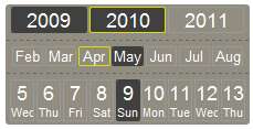
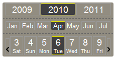
Then I changed a little the CSS to enhance “today” with a yellow border.
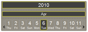
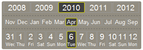
Another new feature is the ability of customizing the amount of years/month/days displayed, so you can have bizarre configurations like these:
Maxime Haineault argued that the next/prev buttons are no fashionable: now you can hide them!
Introducing the wheel movement I had to optimize calls, so callback function is invoked only when the user stops to play with the wheel.
I tried to maintain the code short (actually 180 rows), but the customization of years/months/days requires some computation for cell size; I first tried using only css properties in order to makes cells sharing space equally, but no luck. I need a css-expert’s hint!
You can see CalendarPicker at work here.
Feedback welcome!

Wow, this update is much better, especially with the yellow border and scroll support.
I will give it a good spin and post complete feedback later.
Nice job.
Very nice, far more usable than what I’ve seen so far.
IMO, It would be better if the sundays were graphically differencitated, with a thicker top border, for example, or anything that can be spotted even if the sunday is selected.
A bold font maybe?
There’s a spot right around the dashed lines in between the year/month/day sections that accepts mouse wheel scrolling for the page — would be best to just turn off wheel scrolling for the page in the entire widget. Otherwise good work!
This is a very good date input widget, and an improvement over the initial version. The rendered appearance is very polished.
I learn a lot from examining changesets, would you consider using a source code repository such as Github for future development of CalendarPicker?
Also, time input (alone or with date+time) would be a very valuable addition to this widget.
Thanks.
I like it a lot. Small thing being: don’t make the Selected color the same as the rollover-color. I’m confused as what will happen when I click… It’s not directly clear Which date I selected…
But mousewheel support is nice!
I love the idea! The only improvement i would like is for the Arrows (next/previous day) to be slightly bigger. I like it when it’s easy to click.
I like it!
However…. I initially found the user experience difficult when clicking on a year. I did not realise the item I clicked on became centered…. I was expecting it to become highlighted.
If clicking caused the year to slide into the centre, that would immediately solve my misunderstanding
Similarly with the day of month
Just an idea!
thanks
Hello,
Nice to see some new ideas on this subject, although I’ll be honest, I found it a bit difficult to use, for the following reasons:
* It’s very disorienting when you can’t see all the months on the control and you can spend a good while going back and forth wondering where the month you’re looking for is, only to realise it’s off the side and you have to click on a month you don’t want for it to become visible
* The mouse scrolling goes some way to overcome this, but I found it quite awkward as you have to have the cursor exactly over the scrollable bit, otherwise you end up scrolling the page and getting confused again.
* Overall, it’s just a bit too alien a concept and too much of a learning curve for a casual user.
Sorry if this is a bit negative, I do think this is a subject that requires some new thinking and I applaud your efforts so far! Hope to see some more from yourself soon.
Regards,
Richard
Looks neat but you need to disable the mouse page scrolling when over the calendar and re-enabled it when out. Also the suggestion to have the clicked element slide into the center instead of just appearing is important.
Roberto,
This is a great widget!
I echo the comments from Julien and Jeff, do you have any timeframe of the inclusion of a time selector?
Would like to discuss the latter with you, please follow me at http://twitter.com/johan__ so that we can exchange email addresses (you should have mine now).
Hey
Here is a simple patch of your awesome plugin to enable sliding:
(Removed the arrows as they have less meaning now)
http://eirikb.no/calendarPicker/
Thanks, it’s a wonderful improve!
..but it doesn’t work. If you change the month then the application stops working.
Works here.
What browser?
Note that the months and years does not slide (would the days slide by in an incredible speed, or warp?).
Oh and I should have left out the scrollwheel, it really messes up with my hack.
I’m not that much experienced programmer. 🙂
But I do not know how to change the date format to – YYYY-MM-DD.
Could you please help me.
thanks, best wishes.
Khan
CalendarPicker returns a js “date” object.
There are lots of examples online, here a really basic one:
var curr_date = d.getDate();var curr_month = d.getMonth();
var curr_year = d.getFullYear();
document.write( curr_year +"-" + curr_month + "-" + curr_date ;
Can you show full example
I fiddled with the colours and made a blue one if anyone’s interested.
http://pastebin.com/YmwLhEQ5 <– just replace the stylesheet.
you know what, my customer loved this tool as it raises eyebrows on first impression. I already got the project. Thank bro..
Anyway I would love to here feedback from you if you can spend sometime to teach me how to pass the date to display in mysql format date such as YYYY-mm-dd
not so happy findings… because it’s too long coding
$(“#tarikh”).val(cal.currentDate.getFullYear()+”-“+cal.currentDate.getMonth()+”-“+cal.currentDate.getDate());
I have been looking for this for a very long time. Thank you!
the one modification that I need is that I dont care about days. I just want year and month.
Can this be modified to ignore the dates?
I would also be happy to hire you for the work.
thank you very much my friend. Cheers!
How can I show an event related to the date picked? Maybe a onmouseover tooltip, or a small text at the left/right ride of the calendar?
I like this new spin (pun intended) on datepickers.
IMO, my disorientation comes from seeing the date top down instead of the traditional left to right.
You scroll the wheel mouse up-down/north-south but the action is left-right scrolling on screen – which causes the disconnect in my brain.
I feel your control might work more intuitively if you stick with the scrollwheel idea (which is the big plus on this control), and arrange it more like a jackpot/slot machine – so the scrolling up-down action actually rolls the dates up and down as you hover over each part of the date.
[mm]/[dd]/[yyyy] (or whatever format you’re using) – not to mention it would take less screen real estate.
http://img.brothersoft.com/screenshots/softimage/j/jackpot_clock-166507-1.jpeg