Tons of charting tools, one better than the other, how to find yours?
I was working on adding a new widget for Patapage. Sometime you need to publish a simple graphical report on your page, a chart, based on a small set of data that you may want to change quickly online.
As requirements, I wanted to have an immediate feedback of data and configuration changes so I chose a JavaScript charting tool instead of server-side generating “chart images”.
Few years ago this approach was almost impossible due to the lack of cross-browser plotting libraries. Nowadays there are many powerful plotting tools: this article will introduce some of them and will explain how I got to choose my plotting library.
First of all I had to restrict the selection to those that are licensed for usage in a commercial products, but this is not a big deal; most of them are under LGPL, or MIT license.
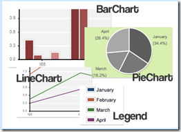 My second requirement was the compatibility of the JavaScript library: we use jQuery so I had to drop the great plotr library that is based on prototype.
Actually Solutoire has also a Prototype porting of flot called Flotr.
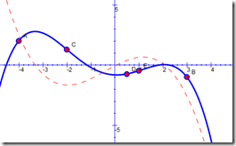 Same technology for Protochart. For the same reason I quit in tears the amazing jsxgraph. What I loved of this library is the universe of interactive examples provided by the community. If you do not have library restrictions have a in-depth look to this jewel (if it doesn’t fit, give yourself at least a recreation playing for few minutes with the examples 🙂 ).
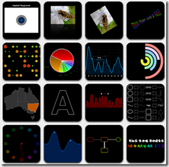 Also Raphael is a real impressive product, but even in this case it doesn’t relay on a “standard” JavaScript library, and mainly it is a low level vector library, in the sense that it doesn’t supply any specific chart plotting functions. If I had to write a graph library from scratch I’ll probably start from here.
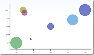 MooTools user will have on their side moochart or canvas pie.
For jQuery fanatics, like me, there are lots of bullets too.
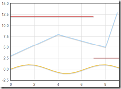
First I started having a look at the flot library. I was astonished to see how well engineered this library is . IMHO one of key point is that the whole configuration is defined by using a JavaScript object, so a basic example that will produce the cart on right side will look like:
<script>$(function () {    var d1 = [];
    for (var i = 0; i < 14; i += 0.5)
        d1.push([i, Math.sin(i)]);
    var d2 = [[0, 3], [4, 8], [8, 5], [9, 13]];
    // a null signifies separate line segments
    var d3 = [[0, 12], [7, 12], null, [7, 2.5], [12, 2.5]];

    $.plot($("#placeholder"), [ d1, d2, d3 ]);
});
</script>
This approach is very practical when you work with json objects, especially for data series. Another nice aspect of this library is that series configuration and data are on the same object. Of course when you need to use advanced charting features (time series, label formats. ticks etc.) the configuration will become quickly complex and not really readable, but on the other hand the basic approach is straight and painless. Unluckily flot at this moment does not implements pie renderers (to be honest there are some implementation from the community – see flot issues), and this was one of my widget requirements. Another little spot is the documentation that is complete but really ‘60 stylish. Even the examples are a bit poor but enough for starting quickly.
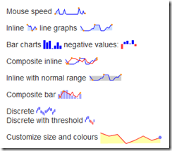 Then i moved to Sparklines that is a very easy-to-use and intriguing library; I like their site with lots of small charts. If you need to create dashboards for your site have a look at this plugin. Even in this case configuration and data uses a JavaScript object.
Sparklines was a little basic for my needs so I tested TufteGraph and jQuery Chart; I found both lacking in features.
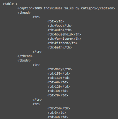
Then I landed in the jQuery Visualize Plugin from Filament group; they have a really smart idea; leave the data on a HTML table!
So the data will look like
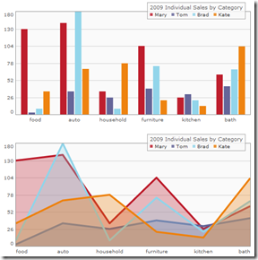 then the configuration is done as usual by passing a JavaScript configuration object to the drawer function. On their site there is a nice sandbox to try configuring your chart.
If you already have table displaying data just add a line of code to have your chart.
Of course this is a completely different approach from flot, where to have the same visual effect you must write tons of lines; on the other hand jQuery Visualize does not give you complete configurability, but only reasonable ones 🙂 . In most cases this could be an effective approach especially if you do not like to spend hours with JavaScript objects and arrays.
I didn’t stops at this station. Next stop jqPlot!
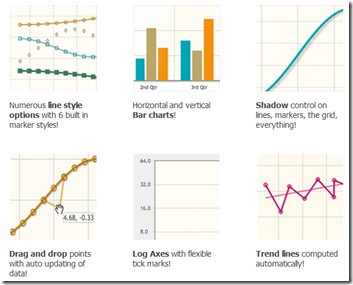 jqPlot is a really well engineered solution, in some sense it has an approach similar to flot, but it has more plotting types (pies too!), a great documentation online and a lot of examples.
Here both data and configuration are JavaScript objects but are separated, two parameters on the drawing calls.
I appreciated the “default renderer” configuration so you do not need to write too much in case of multiple data series (unlike flot).
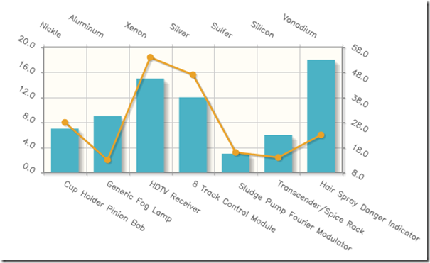
The other key factor of this library is the complete pluggability of the renderer; you can have renderers for axis, labels, ticks etc. This approach for instance makes it possible to have labels rendered by canvas:
The separation between data and configuration helped me to realize my Patapage widget.
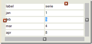 I made an editable table that refreshes on-the-fly chart values and a set of options to change the graph layout. Both data and configuration are serialized, so to be easily stored server-side.
I have set up a playground in order to test my Graph component, that covers only few of jqPlot features, but should give you an idea about this component.
For the sake of completeness I have to cite Google Chart API and Yahoo YUI Chart Controls, that require to bind tightly with these too small players 🙂 . No thanks, next time maybe.

